Products
Projects
Resources

Anyplace Called Home
January 26, 2022
This Dorchester home looks like any other on the outside. It’s a home like many others, one that is both entirely unique and just like the neighbors. When this project came through our doors, we wanted to amplify that. Create something that would stand out, yet anyone would feel at home with. With bold finish choices and a little rearranging, we did exactly that.

Our clients came to us with a problem. They loved their home but the kitchen was a bit of a mess. They knew that they needed an upgrade, and they were more than ready for it. The kitchen is the central hub of their home, and it was leaving a lot to be desired. There was a wood stove in the middle of the kitchen that everything was clustered around. The stovepipe ran straight up to the ceiling, both obstructing the view between the kitchen and dining spaces and feeling out of place.

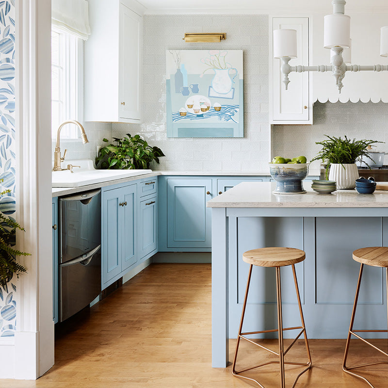
With a family of 4, it was important that this kitchen withstand the test of heavy use. We wanted it to be utilitarian, but with a bright energizing feel to it. To make the most of the space, we used cabinetry features like rollout drawers, pull-out spice rack and a lazy susan for the corner cabinet. One feature that helped define our space was using a peninsula instead of an island.

By converting the island to a peninsula, we were able to consolidate part of the kitchen so that we could keep the function and create a sense of space. It comes with all the same features of dividing the space with seating, cabinetry and a counter to work off. However, you only need to save space for a walkway on one side, instead of two. This creates more room for cabinetry and counter space.

Once we got the floor plan down, Brad and Kendra of Color Theory Boston started filling in some of the design elements. They knew that we wanted a bold color for the peninsula and walnut for the wall cabinets. In combining the walnut with the white frames they were able to create some bright contrast. You still get that natural sense of the warmth that wood brings without it overwhelming the space. We landed on a dark turquoise color for the island to establish the bright color pop.

The vibrant colors combined with the natural light from the skylights create a space that will help you breathe life into your day. Our clients trusted their team throughout the process. From layout to design choices, to dealing with structural issues, we were able to manage it all. It also creates a sense of freedom for everyone when it came time to make creative choices.

All projects have their unexpected surprises, and for this one, it was uncovering a structural issue with one of the largest walls. It was costly in both time and money, but we managed to work through it. The work was done by Toby Wells of Wells & Company. We had a great relationship with both Toby and Color Theory Design and that made the whole process go a lot smoother. We did have a few supply chain issues, but that’s the normal state of any project these days.

This was an exciting project to work on because of the unique design and color opportunities. The colors really stand out, but they are also very versatile. You can fill the space with any style and it seems to fit. What was once a crowded space has transformed into something bright and inspiring. The perfect place to start and end your day for anyone that calls this place home.
Kitchen & Cabinetry Design by Grand Banks
Work done by Wells & Company
Interior Design by Color Theory Boston
Cabinetry:
Shiloh Semi-Custom Cabinetry
Flush Inset Perimeter Cabinetry Door Style: Manhattan, Finish: Painted Arctic Doors / Natural Stained Faceframe , Species: MDF / Walnut
Design Craft Semi-Custom Frameless Island Cabinetry
Subscribe Today!
Our goal is to provide you with as much information as possible. Our newsletter is full of tips, inspiration and featured projects. We promise to only send you interesting things and never share your email with anyone else.


